Testimonial Component with Client Avatars (SolidJs)
Published: 2024-09-25
The Problem
I wanted to create a testimonial section for a business’ website. The component needed to have the following features:
- Be able create testimonials from a list of testimonials (To make it easier to edit or add more in the case of using a CMS or through aggregation from other websites)
- Be scrollable as a carousel as I did not want the testimonials to be listed vertically in a list as they would take up too much space.
- Each of the client’s reviews will have an avatar to match the theme of the website - A personal touch without being too personal.
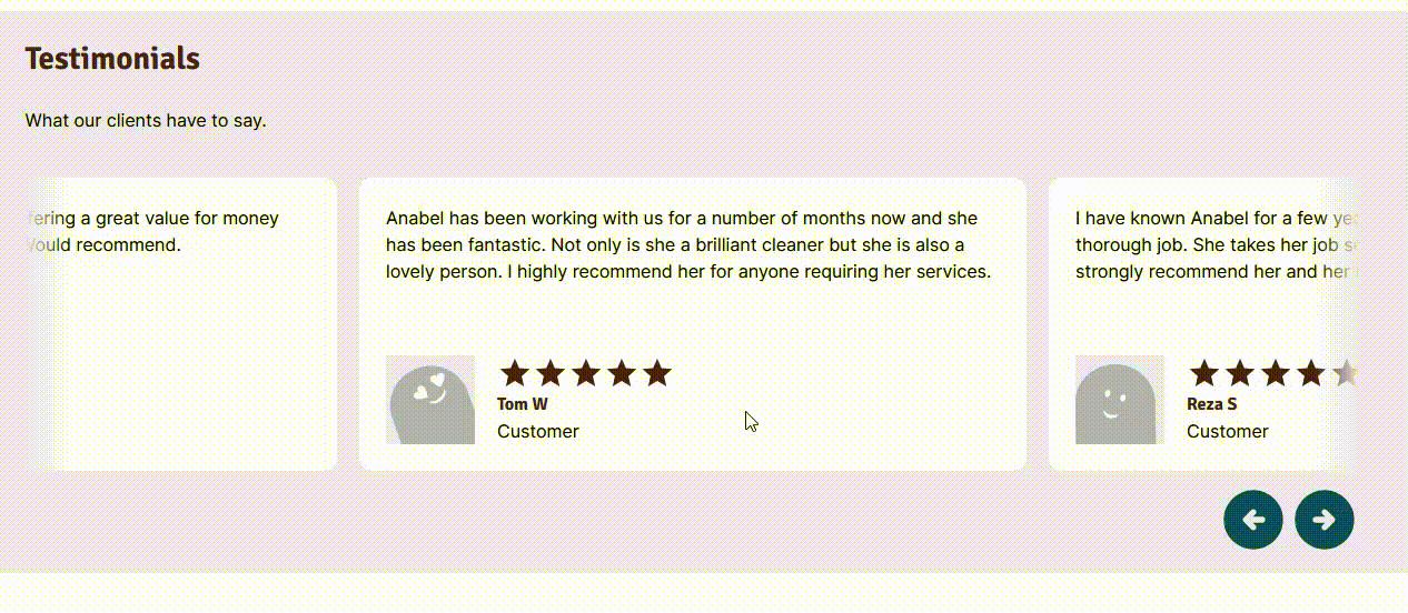
Planning
I jumped into Figma to make a design. IMAGE The blue square represents the client avatar.
I wanted to take advantage of using NPM libraries so decided it would be easier to use JSX instead of Astro for my components.
I already know how to use React but I settled on using SolidJS to make my components. One of the reasons is because of Solid’s performance, due to optimizations like a smaller bundle size and direct DOM manipulation instead of using a Virtual-DOM.
Solid is also similar to React in some ways, such as how state is handled and the use of JSX templates so it shouldn’t be too much of a learning curve.
The solution
Carousel Library
I usually use Splide to make carousels but I wanted to give Embla Carousel a try. Embla’s bundle size is half that of Splide’s and also I feel it’s important to try new things to be aware of all the tools at your disposal.
User Thumbnails Library
I found an open-source library, DiceBear which can programmatically create avatars. The cool thing about this library is that I can provide the name of the reviewer as a seed to create unique avatars for the client.
Styling
I also used Tailwind for the CSS as I was already using it in the project.
The Code
I decided to split the testimonials into 3 separate components.
- Testimonial-Single.tsx - Card for each
- Testimonial-Stars.tsx - Utility component which takes a rating number (out of 5) and displays stars.
- Testimonial.tsx - Contains the Embla Carousel wrapper
A Review Card
This is the review card which goes within the carousel.
Testimonial-Single.tsx
import { StarRating } from "./Testimonial-Stars";
import { createAvatar } from "@dicebear/core";
import { thumbs } from "@dicebear/collection";

export function TestimonialSingle(props) {
  const avatar = createAvatar(thumbs, {
    seed: props.name,
    shapeColor: ["A6B1E1"],
    backgroundColor: ["ece8ff"],
  });
  const svg = avatar.toString();
  return (
    <div
      class="flex h-full select-none flex-col-reverse justify-between rounded-xl p-6"
      style={{ background: "white" }}
    >
      <div class="flex">
        <div class="mr-5 inline h-20 w-20 bg-gray-400" innerHTML={svg}></div>
        <div>
          <span class="Rating">
            <StarRating rating={props.rating} />
            {props.service ? props.service : ""}
          </span>
          <h3>{props.name || "Name Name"}</h3>
          <span>{props.businessName || "Customer"}</span>
        </div>
      </div>
      <p class="mt-0">{props.reviewText || "Review text not found."}</p>
    </div>
  );
}
Stars
I needed a utility component to display the stars for the reviews. I built this as a separate component as it makes it easier to implement different star icons depending on which review site it came from. Eg trustpilot has green bordered styles.
I definitely over-engineered this part, as we’re going to only hand pick reviews which are rated 4 or 5 stars. This could and should be replaced with two images, 4 and 5 stars respectively.
Testimonial-Stars.tsx
function Star() {
  return (
    <svg
      xmlns="http://www.w3.org/2000/svg"
      width="100%"
      height="100%"
      viewBox="0 0 24 24"
    >
      <path
        fill="currentColor"
        d="M12 17.27L18.18 21l-1.64-7.03L22 9.24l-7.19-.61L12 2L9.19 8.63L2 9.24l5.46 4.73L5.82 21z"
      />
    </svg>
  );
}

export function StarRating(props) {
  const width = 100 - (props.rating / 5) * 100;

  return (
    <div class="relative">
      <div class="flex h-8">
                <Star />
                <Star />
                <Star />
                <Star />
                <Star />
      </div>
            <div
        class={`absolute right-0 top-0 h-8 bg-white`}
        style={{ width: `${width}%` }}
      ></div>
    </div>
  );
}
Testimonial.tsx
import { createSignal, For } from 'solid-js'
import { TestimonialSingle } from './Testimonial-Single'
import createEmblaCarousel from 'embla-carousel-solid'


const data = [{...}] // Each must contain: name, reviewText, Rating (number)


export function Testimonial(props) {
  const [emblaRef, emblaApi] = createEmblaCarousel(() => ({ loop: true }))
  const [reviewData, setReviewData] = createSignal(data)

  // Carousel nav button controls
  const scrollPrev = () => {
    emblaApi().scrollPrev()
  }
  const scrollNext = () => {
    emblaApi().scrollNext()
  }

  return (
    <div class="wrapper" style={{ background: '#ece8ff' }}>
      <h2>{props.title || 'Testimonials'}</h2>
      <p>{props.test || 'What our clients have to say.'}</p>
      <div class="pt-6">
        <div class="embla">
        {/* Carousel starts */}
          <div class="embla__viewport" ref={emblaRef}>
            <div class="embla__container">
              <For each={reviewData()}>
                {(review, i) => (
                  <div class="embla__slide">
                    <TestimonialSingle
                      name={review.name}
                      reviewText={review.reviewText}
                      rating={review.rating}
                      source={review.source}
                    />
                  </div>
                )}
              </For>
            </div>
          </div>
          {/* Carousel ends */}
          {/* Carousel nav buttons */}
          <div class="mb-4 flex justify-end pt-3 text-primary">
            <button class="embla__prev" onClick={scrollPrev}>
              <svg
                xmlns="http://www.w3.org/2000/svg"
                width="4rem"
                height="100%"
                viewBox="0 0 24 24"
              >
                <path
                  fill="currentColor"
                  d="M11.8 13H15q.425 0 .713-.288T16 12t-.288-.712T15 11h-3.2l.9-.9q.275-.275.275-.7t-.275-.7t-.7-.275t-.7.275l-2.6 2.6q-.3.3-.3.7t.3.7l2.6 2.6q.275.275.7.275t.7-.275t.275-.7t-.275-.7zm.2 9q-2.075 0-3.9-.788t-3.175-2.137T2.788 15.9T2 12t.788-3.9t2.137-3.175T8.1 2.788T12 2t3.9.788t3.175 2.137T21.213 8.1T22 12t-.788 3.9t-2.137 3.175t-3.175 2.138T12 22"
                />
              </svg>
            </button>
            <button class="embla__next" onClick={scrollNext}>
              <svg
                xmlns="http://www.w3.org/2000/svg"
                width="4rem"
                height="100%"
                viewBox="0 0 24 24"
              >
                <path
                  fill="currentColor"
                  d="M12 22q-2.075 0-3.9-.788t-3.175-2.137T2.788 15.9T2 12t.788-3.9t2.137-3.175T8.1 2.788T12 2t3.9.788t3.175 2.137T21.213 8.1T22 12t-.788 3.9t-2.137 3.175t-3.175 2.138T12 22m.2-9l-.9.9q-.275.275-.275.7t.275.7t.7.275t.7-.275l2.6-2.6q.3-.3.3-.7t-.3-.7l-2.6-2.6q-.275-.275-.7-.275t-.7.275t-.275.7t.275.7l.9.9H9q-.425 0-.712.288T8 12t.288.713T9 13z"
                />
              </svg>
            </button>
          </div>
        </div>
      </div>
    </div>
  )
}